
>ENTRY_01
Tiny Website, Tiny Dreams
written 12/15/2023_
So, some people are pretty damn good with web design.
I am not one of those people.
Well, okay, that's somewhat of a misnomer. I'm not bad at HTML; hell, many years ago I took a class on it, and I'd like to think I did just fine. Decent enough at writing my own stuff, I learned the lingo, I know what padding is versus, uh, that other thing. You know what I'm talking about, right?
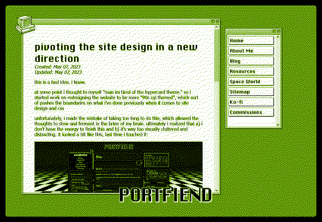
WINDERTWINE was concepted to be my pet project, a website that played to my strengths and interests. For as long as I've had it, I've wanted to have it as a frame-within-a-frame computer monitor. I was fascinated by the hypertext theme of my friend Portfiend, who - although they've changed it now - had a flair for making a lot with just a little.
When looking to justify my brand of web design, I always find myself drifting back to The House Abandon - perhaps one of the most influential games I've ever witnessed. It captured my attention like nothing else. The framing of a computer BURSTING with viscera appealed to me in a way that nothing else had, and that's what I wanted to theme my site off of. It just felt right.
On web design
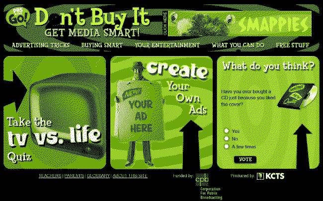
There's more to it than than just a single game, though. I also find myself thinking of the old websites I used to explore as a kid: Don't Buy It stands out in my mind. A website like this was neat, carefully constructed, and looked fantastic on a little monitor. It evokes a playground that's both compact and easy to navigate.
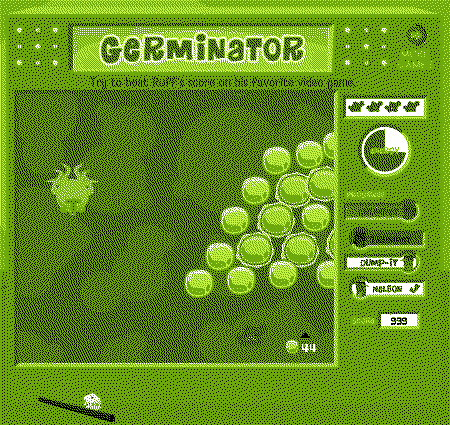
However, there's a second contender: old flash games. I was raised on the internet, and a lot of my earliest memories involve noodling around on websites built for little kids. Those had games, and flash games came in containers. Sometimes they were styled to LOOK like screens themselves, such as Germinator from Fetch! That's an old favorite. Helps to have a fixation on the body and all its weird processes.
Even the absolutely anicent Cyberchase: THE QUEST had its own special border, though that was more of an in-game thing. I played this way, way too much, and I can't even tell you if I've ever beaten it. If anyone out there recognizes that name, props to you. Up until today I forgot this game existed.
.png)
The more I think about it, the more I've come to realize my love for compartmentalization stems from my own brand of web nostalgia. Examples like these are as much a trip down memory lane as they are expressions of myself.
In summation
Tiny websites reflect my current bias towards minimalism, but in a different direction than what the modern web follows. Portfiend has some fantastically insightful takes on minimalism, or what the modern web does wrong about it. I agree. I think if I had to make this website "corporate" I'd lose my marbles.
By the same token, though, I'm a bit wary of websites I find too maximalist. There's nothing wrong with a webmaster that enjoys vibrant design! I salute their authenticity! However, by stuffing every corner of their screen with widgets, their lovingly-crafted spaces tend to choke me out. Images overlap, and text becomes illegible on my silly little laptop screen. Some will proudly proclaim to be viewed only on web; however, my version of viewing-on-web is markedly different from theirs.
I think there's really something to be said for my love of close, compact, cozy web design. The frame-within-a-frame was something I wanted, very hard, to make work. However, it's almost 2024, and this is a website I established in 2022. I haven't yet had the time or energy to commit to cleaning up my website into a workable state.
But for as much as I've contemplated it before, I can't yet get rid of the simple, sweet framework of a 800x600 monitor. It's just not in my blood.
MY GOD IT WAS MARGINS
/end